Let us learn how to create a responsive layout in the lightning web component.
We will use lightning-layout and lightning-layout-item base components to create a responsive web component. So let's jump into it.
About lightning-layout and lightning-layout-item components.
These components are used to create a responsive grid in lightning components.
Lightning layout components are based on the
slds-grid.
lightning-layout - Is a container for the layout items, which is divided into 1 to 12 columns.
lightning-layout-item - this is a placeholder for the divided columns in the lightning-layout component. You can have multiple layout items inside a layout.
A simple example of a grid in lwc
The below code creates a layout with four columns of an equal size.
<template>
    <lightning-layout>
        <lightning-layout-item padding="around-small">
            <div class="custom-box slds-box slds-p-around_medium slds-text-align_center">1</div>
        </lightning-layout-item>
        <lightning-layout-item padding="around-small">
            <div class="custom-box slds-box slds-p-around_medium slds-text-align_center">2</div>
        </lightning-layout-item>
        <lightning-layout-item padding="around-small">
            <div class="custom-box slds-box slds-p-around_medium slds-text-align_center">3</div>
        </lightning-layout-item>
        <lightning-layout-item padding="around-small">
            <div class="custom-box slds-box slds-p-around_medium slds-text-align_center">4</div>
        </lightning-layout-item>
    </lightning-layout>
</template>
How to make a lightning layout responsive?
For that, we need to set the size attributes to the
lightning-layout-item.
size-- default size, mobile devices.-
small-device-size-- size when the device is larger than mobile. -
medium-device-size-- size when the device is larger than tablets. -
large-device-size-- size when the device is larger than desktop.
Let's see the below example.
<template>
    <div class="slds-box slds-p-around_none slds-m-top_x-small slds-m-bottom_medium slds-m-horizontal_none">
        <lightning-layout multiple-rows>
            <lightning-layout-item padding="around-small" size="12" small-device-size="6" medium-device-size="4" large-device-size="3">
                <div class="custom-box slds-box slds-p-around_medium slds-text-align_center">1</div>
            </lightning-layout-item>
            <lightning-layout-item padding="around-small" size="12" small-device-size="6" medium-device-size="4" large-device-size="3">
                <div class="custom-box slds-box slds-p-around_medium slds-text-align_center">2</div>
            </lightning-layout-item>
            <lightning-layout-item padding="around-small" size="12" small-device-size="6" medium-device-size="4" large-device-size="3">
                <div class="custom-box slds-box slds-p-around_medium slds-text-align_center" size="12" small-device-size="6" medium-device-size="4" large-device-size="3">3</div>
            </lightning-layout-item>
            <lightning-layout-item padding="around-small" size="12" small-device-size="6" medium-device-size="4" large-device-size="3">
                <div class="custom-box slds-box slds-p-around_medium slds-text-align_center">4</div>
            </lightning-layout-item>
        </lightning-layout>
    </div>
</template>
Result:
Size of the layout item set to 12 (100%) for mobile devices.

|
| Mobile View |
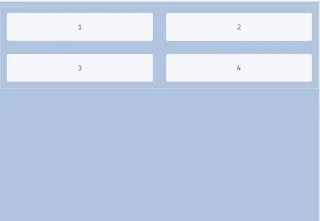
Size of the layout item set to 6 (50%) for tablets.

|
| Tablet View |
Size of the layout item set to 4 (33.33%) for medium-sized devices small
screen laptops.

|
| medium-sized devices view |
Size of the layout item set to 3 (25%) for desktops.
Live playground

|
| Desktop view |
Further customizations
You can customize the sizes as per your requirements. Like a two-column
layout, three-column layouts using these properties of the layout items.
Two-column layout.
<template>
    <div class="slds-box slds-p-around_none slds-m-top_x-small slds-m-bottom_medium slds-m-horizontal_none">
        <lightning-layout multiple-rows>
            <lightning-layout-item padding="around-small" size="12" small-device-size="12" medium-device-size="4">
                <div class="custom-box slds-box slds-p-around_medium slds-text-align_center">1</div>
            </lightning-layout-item>
            <lightning-layout-item padding="around-small" size="12" small-device-size="12" medium-device-size="8">
                <div class="custom-box slds-box slds-p-around_medium slds-text-align_center">2</div>
            </lightning-layout-item>
        </lightning-layout>
    </div>
</template>
Three-column layout
<template>
    <div class="slds-box slds-p-around_none slds-m-top_x-small slds-m-bottom_medium slds-m-horizontal_none">
        <lightning-layout multiple-rows>
            <lightning-layout-item padding="around-small" size="12" small-device-size="12" medium-device-size="3">
                <div class="custom-box slds-box slds-p-around_medium slds-text-align_center">1</div>
            </lightning-layout-item>
            <lightning-layout-item padding="around-small" size="12" small-device-size="12" medium-device-size="6">
                <div class="custom-box slds-box slds-p-around_medium slds-text-align_center">2</div>
            </lightning-layout-item>
            <lightning-layout-item padding="around-small" size="12" small-device-size="12" medium-device-size="3">
                <div class="custom-box slds-box slds-p-around_medium slds-text-align_center">2</div>
            </lightning-layout-item>
        </lightning-layout>
    </div>
</template>
I hope this is helpful, thanks for visiting 🙏

No comments :
Post a Comment
Hi there, comments on this site are moderated, you might need to wait until your comment is published. Spam and promotions will be deleted. Sorry for the inconvenience but we have moderated the comments for the safety of this website users. If you have any concern, or if you are not able to comment for some reason, email us at rahul@forcetrails.com